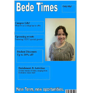
 When you look at my final piece, it is of a much higher standard and there's literally nothing in common between the two at all. This is a good thing when you look at the original though. It looks sort of like a free newspaper with the biggest ink bill known to man. The fact I coloured the entire background in blue needs no words.
If I had to try and find similarities, I would have to look at the colour scheme which is majorly blue and white, which you could argue is relational to my red and white colour scheme on my final piece; it is clear that I have taken much more consideration into the layout. By studying different magazines that are already on the market, I was able to gain knowledge of certain music magazine conventions, and ensure that I included them in mine.

Looking back on the contents page of my college magazine I can see that I had very little knowledge of magazines and how they should look when I create that. It is very simple and very basic, and comparing it to the likes of NME magazine it isn't a magazine contents page at all. It is obviously that I have definitely learnt my way around magazine conventions, and what is needed and expected of a magazine in order to give the reader as much information as possible. The contents page looks professional and actually has images on, unlike my college magazine's contents page which simply has 4 pages of content listed and nothing else.

One of the most striking things that is made known by comparing my preliminary task and my final product is my widened knowledge of new technology. I created the preliminary task in Microsoft Publisher, and hadn't even considered using Photoshop as my knowledge was very limited. However now I have created a successful series of documents using Photoshop which are all consistent and have a very professional feel to them.


Overall, I feel that I have made huge progress from my preliminary task to my final product, and I have used my resources and feedback from the first task to my advantage to achieve a good final product.
No comments:
Post a Comment